Table of Contents
- What to Specify for Printed Spout Pouches
- Prepare Production-Ready Artwork
- Choose Colors and Manage Expectations
- Understand the Print Process and Registration
- Select a Surface Finish
- Design Around the Spout and Seals
- Review Proofs Before Production
- Build a Clear Print Specification
A practical B2B guide to preparing artwork and selecting colors, print methods, and finishes for custom printed spout pouches.
What to Specify for Custom Printed Spout Pouches
Custom printed spout pouches require artwork that is designed for a flexible laminate, a defined color system, and a finish selected for the product, filling process, and shelf presentation. Before quoting or releasing production, buyers should provide the pouch size and format, laminate structure, spout position and fitment, print colors, finish, artwork files, and the intended filling conditions. These inputs allow the converter to set the printable web layout and identify areas where printing, sealing, or fitment installation may affect the final appearance.
Printing is typically applied to the reverse side of the outer film before that film is laminated to barrier and sealant layers. This reverse-print construction protects the ink within the laminate rather than leaving it on the consumer-facing exterior. The final pouch appearance is therefore influenced by the outer film type, ink system, adhesive, laminate, and any matte or gloss treatment, not only by the artwork file.
Do not treat graphics as separate from package engineering. A metallic barrier layer can change how colors appear, a clear window changes the printable area, and a high-temperature filling process may limit suitable material structures. Start by defining the product and package requirements, then develop the print specification around the approved construction. Buyers selecting the laminate at the same time can use this guide to choose a spout pouch laminate for the product and process.
Prepare Production-Ready Artwork
Provide editable vector artwork whenever possible. Adobe Illustrator or print-ready PDF files are common starting points, but the supplier should confirm its preferred file format, color profile, dieline procedure, and prepress checklist. A flattened image alone may not allow prepress teams to adjust trapping, overprint settings, separations, or text.
Set logos, text, icons, and line art as vectors. Use raster images at sufficient effective resolution at final print size; low-resolution images can look soft or pixelated after enlargement. Convert or package fonts according to the supplier’s instructions, and retain a controlled master file so that later revisions can be traced.
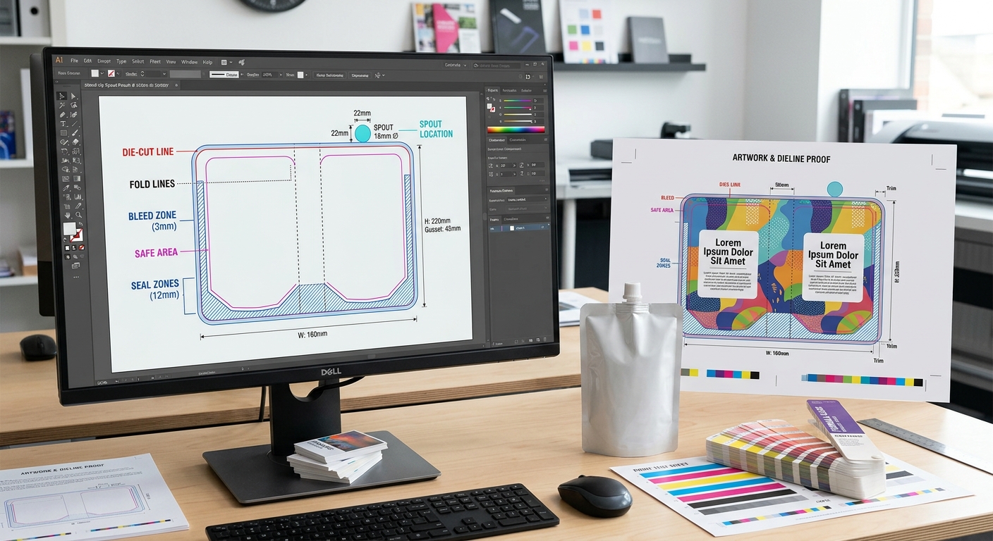
Artwork should be built on the approved pouch dieline, not on a generic rectangle. The dieline should show the pouch perimeter, gusset or bottom fold, heat-seal zones, spout and cap location, trim area, print repeat direction, and any non-print areas. Keep mandatory text, barcodes, and brand elements inside the designated safe area. Backgrounds and non-critical graphics can extend into bleed where instructed.
- Bleed: Extra image area beyond the trim or seal boundary that avoids an unintended unprinted edge.
- Safe area: The zone where important copy remains clear of trim variation, folds, seals, and fitments.
- Seal area: A pouch edge or structural zone reserved for heat sealing; ink coverage may need restrictions.
- Knockout: An unprinted area created by removing one or more color separations, often used for white copy or a clear window.
Confirm the final net contents statement, country-specific labeling, barcode requirements, batch-code location, and any legal marks with the responsible brand owner or market specialist. The packaging manufacturer can check print feasibility, but it should not be assumed to validate a customer’s regulatory copy.
Choose Colors and Manage Expectations
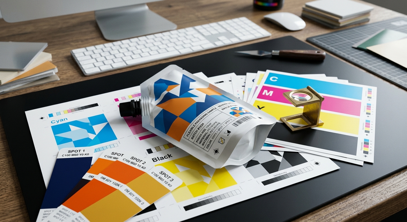
For custom printed spout pouches, color selection begins with the intended color system. Process-color artwork uses CMYK dots to reproduce a wide range of images and shades. Spot colors use premixed inks identified by a defined color reference, commonly a Pantone matching system reference where applicable. A design may combine CMYK imagery with spot-color brand elements, white, varnish, or special effects.
Spot colors are often considered when a logo or key brand color needs consistent treatment across a design. They are not automatically the right choice for every project: each additional color can affect setup, cylinder or plate requirements, press planning, lead time, and order economics. Ask the supplier to recommend a practical color build after reviewing artwork, expected order volume, and the selected print process.
On transparent, metallized, white, or aluminum-based laminates, the same ink recipe can produce visibly different results. White ink may be used behind graphics to create opacity and stabilize color appearance. Conversely, intentionally omitting white behind selected graphics can let a metallic or transparent substrate show through. Specify whether each graphic area is intended to be opaque, metallic-looking, or transparent; do not rely only on a screen preview.
Use the following information in the artwork brief:
- CMYK values and the intended color profile for process artwork.
- Named spot-color references for critical brand colors.
- Whether white is a flood, selective backing, or a visible design color.
- Whether colors must match an existing approved package, sample, or brand standard.
- Whether color variation across separate production runs requires a formal approval method.
Digital displays, office printers, and uncalibrated inkjet mockups are useful for layout review but are not reliable production color standards. A contract proof, press proof where available, or approved physical reference provides a more meaningful basis for color review. Color approval should also state the viewing conditions and which elements are critical.
Understand the Print Process and Registration
Flexible pouch graphics are commonly produced with flexographic or gravure printing, depending on the supplier’s equipment, artwork, run length, and project requirements. Both methods print a repeating web before conversion into individual pouches. The appropriate process is a manufacturing decision that should be discussed with the converter rather than assumed from a visual design alone.
Registration is the alignment of separate colors and design elements during printing and converting. Fine reversed text, narrow borders, multi-color type, and graphics positioned close to seals can be sensitive to normal process tolerances. Simplify extremely fine details where practical, avoid relying on hairline rules at critical boundaries, and give prepress enough time to identify high-risk elements.
Trapping helps manage small color-to-color movement by allowing one color to overlap or underlap another in a controlled way. Prepress may apply trapping to avoid gaps between adjacent colors. The correct treatment depends on the colors, design, print process, and substrate, so designers should avoid manually adding arbitrary traps unless agreed with the supplier.
Ask whether variable data, such as lot codes or date codes, will be added during pouch manufacture, at filling, or after packing. Reserve an appropriate coding panel with enough contrast and a suitable surface for the chosen coding method. This is particularly important when a dark matte design or heavily printed panel could reduce code legibility.
Select a Surface Finish
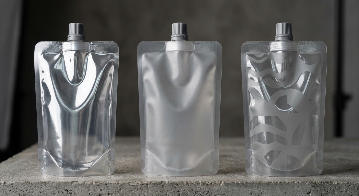
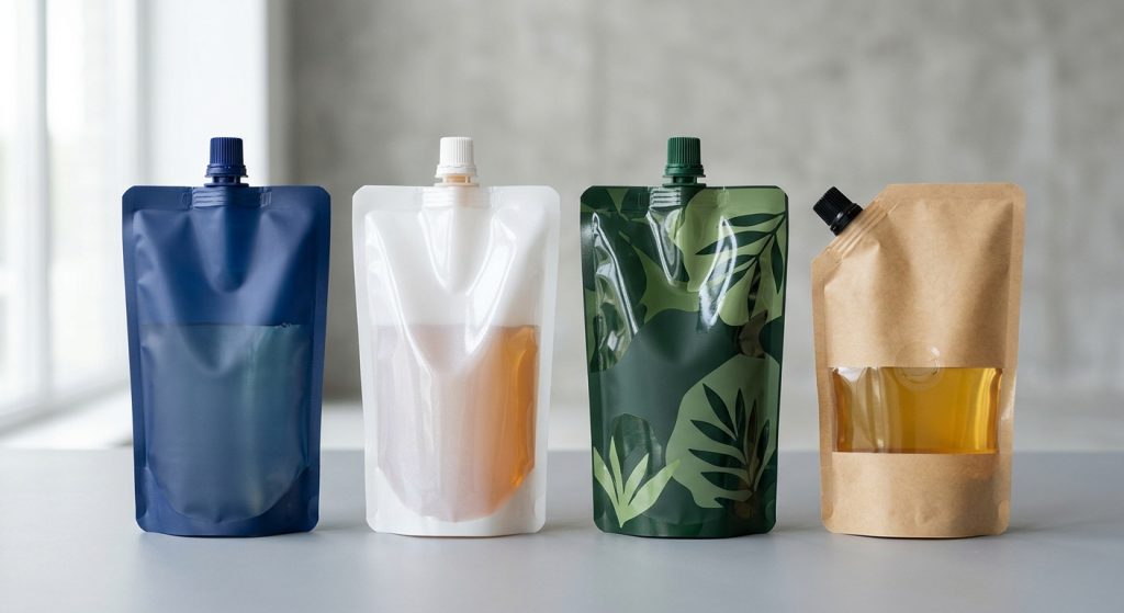
Gloss, matte, and registered matte-gloss combinations are common visual finish directions for printed spout pouches. A gloss surface can make colors and photographs appear more vivid under typical retail lighting. A matte surface reduces reflectivity and can support a restrained or premium visual direction. A registered matte-gloss treatment applies contrasting effects to selected design areas, such as a glossy logo over a matte background.
Finish selection should be reviewed as a physical sample, not approved from artwork alone. The feel and appearance can vary with the selected outer film, printed color density, varnish or coating system, and light source. Matte surfaces can also make scuffs, handling marks, or fingerprints more noticeable in some dark solid-color designs. The likely distribution environment and expected consumer handling should be part of the discussion.
If the design includes a clear product window, define its exact location, shape, and relationship to barrier needs. A window can affect opacity, product-light exposure, and the available printable surface. The laminate structure should therefore be confirmed before finalizing the graphics. Where pouches will be hot filled or retorted, finish must be evaluated as part of the complete package specification rather than as a cosmetic add-on. Buyers can review relevant process inputs in this guide to specifying hot-fill pouch structures or the related retort spout pouch specification guide.
Design Around the Spout and Seals
A spout pouch is not printed like a flat label. The fitment, cap, pouch seals, folds, and gusset create functional zones that affect artwork placement. Keep small text, QR codes, barcodes, and precise decorative borders away from the spout base, heat seals, bottom folds, and side gussets unless the approved dieline specifically permits them.
Confirm whether the pouch will have a top-center, corner, or other spout configuration before artwork is finalized. The orientation of front and back panels, cap direction, and filling-machine handling can change which panel is consumer-facing and how graphics should read when the pouch stands or hangs. A design that appears correct on a flat screen can be awkward when wrapped around a filled pouch.
Use clear visual hierarchy near the opening. Product name, flavor or variant, net contents, and use instructions should remain legible without conflicting with the cap or spout. If a pour, squeeze, or dispensing instruction is included, review it with an assembled sample. For fitment considerations that affect the printable layout, see this guide to spout pouch caps and fitments.
Artwork also needs to reflect how the pouch will run on the filler. Registration marks, pouch orientation, and fitment geometry may be relevant to automatic equipment. Early coordination with the packer helps avoid a design revision after filling trials; this spout pouch filling machine compatibility guide outlines the operating inputs to confirm.
Review Proofs Before Production
Proofing is the controlled review stage between artwork release and full production. Its purpose is to confirm content, layout, color intent, and manufacturing feasibility before the job proceeds. The exact proof type depends on the project and supplier workflow, so buyers should ask what the proof represents and what it does not represent.
A digital prepress proof is useful for checking spelling, image placement, dieline alignment, color separations, and version control. It may not fully represent the final substrate, ink density, gloss level, or conversion effects. A physical drawdown, laminate sample, press proof, or retained approved production sample can provide more relevant visual information when finish or critical brand colors are important. Availability and suitability should be confirmed for each order.
Assign one authorized approver and use a documented revision process. Marking up a proof with scattered changes from multiple stakeholders can create contradictory instructions. The final approval should identify the artwork version, date, pouch specification, and any agreed color reference. If artwork changes after printing components are prepared, new setup charges or lead-time effects may apply. Printing complexity is also one of several variables explained in this guide to custom spout pouch cost factors.
Before approval, check product names, languages, nutrition or ingredient panels if applicable, net contents, barcode quiet zones, variant identifiers, contact details, recycling or disposal claims, and code-panel placement. Read all text at actual size. Verify front and back panel orientation against the confirmed spout position rather than relying on a two-dimensional artwork view.
Build a Clear Print Specification
A complete print brief reduces preventable revision cycles and gives suppliers a sound basis for technical review and quotation. The buyer should identify which requirements are fixed and which can be optimized by the converter. For example, brand colors and required copy may be fixed, while the number of separations, outer-film selection, or finish construction may be open for recommendation.
Include the following in the request:
- Pouch type, dimensions, target fill volume, and orientation.
- Product description, viscosity, contact requirements, shelf-life target, and filling or thermal process.
- Spout diameter or fitment type, cap style, spout location, and filling-machine information.
- Proposed laminate structure or the barrier, clarity, stiffness, and process requirements needed to select one.
- Editable artwork, current dieline status, number of versions or SKUs, and intended print colors.
- Required finish: gloss, matte, selective matte-gloss, clear window, or other defined appearance.
- Critical brand-color references, approved samples, and the preferred proofing method.
- Order quantity, delivery location, timing, and whether samples are needed before the full order.
State assumptions explicitly if information is still pending. For example, identify an artwork file as preliminary, a color as subject to brand approval, or a fill process as not yet validated. This keeps commercial discussions accurate and helps the supplier distinguish a concept estimate from a production-ready quotation.
For any new combination of product, pouch structure, fitment, and filling process, plan appropriate package validation before commercialization. Print approval confirms graphics; it does not by itself establish seal integrity or product-package compatibility. Package testing should reflect the actual conditions the filled pouch is expected to encounter.